Your lying eyes
 The old J4400 collection of Grisly Examples is undergoing refurbishment this year, because a lot of it is frankly a bit long in the tooth. And one of my favorite examples of visual deck-stacking, from the NYTimes Sunday Business front, has to come with a warning label because the Times (huzzah) stopping using that particular annoying trick.
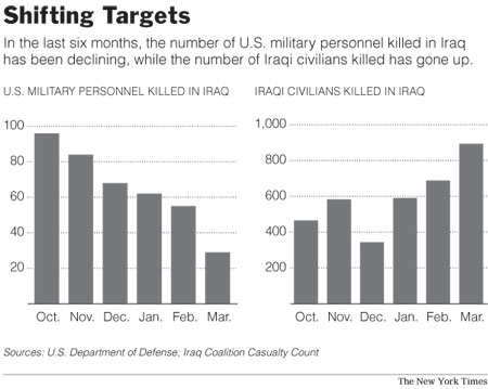
Well, it's back, as in this graphic from Sunday's A section. On a quick glance, it looks as if the Iraqi and U.S. death counts have more or less changed places. If you pay a bit of attention to the Y axis, though, you'll notice something. The horizontal lines are increments of 20 for U.S. deaths and increments of 200 for Iraqis. Makes a bit of a difference when you consider that the entire U.S. side of the alleged graphic could fit in half of one tick on the Iraq side. So who are you going to believe: The numbers or your lying eyes?
Those of you who remember the good old days of British journalism ("One Englishman is a story. Ten Frenchmen are a story ...") may now insert your own jokes here. Those of you who want to do graphics for a living may silently renew your vows to be visually honest. And those who work for the Times, you can just hang your heads in shame.
posted by fev at 5:47 PM
![]()
![]()

2 Comments:
I don't see the point of adding such perspective, even if the graphic did an adequate job of it. The article and graphic are comparing two numbers, US (not "coalition") military deaths and Iraqi civilian deaths, not two proportions. Including the entire Iraqi population (ie, the south and the Kurdish provinces) would bias the measure pretty grossly if we're talking about violence that's occurring primarily in the center. And if the comparison were relevant, why would a distortion by a factor of 10 be much of an improvement if it's still off by a factor of 20?
None of which gets to the point, which is that it's fundamentally misleading to invite a visual comparison by running the two charts side by side and waiting for the poor reader to get to the y-axis label before discovering they're two entirely different things. There are lots of ways to present information of this sort accurately and honestly. This isn't any of them.
Playing games with the axis is one of the things dealt with in the "How to Lie With . . . " series of pamphlets by Mark Monmonier et al on the topic of misleading with statistics, maps, charts and so on.
If the designer is lazy or stupid, that's one thing. If the designer knows that readers tend to look at things spatially without referring to the legend, then he/she is attempting to mislead.
Most people will glance at the chart and never realize that one measurement is x10 the other. Whether this is sin or stupidity is always up for debate, but given the level of incompetence displayed by the NYT lately, I'd guess the latter.
Maybe they can just give the graphic a headline like "Fake but Accurate."
Post a Comment
<< Home